Rabah360 Brand Identity
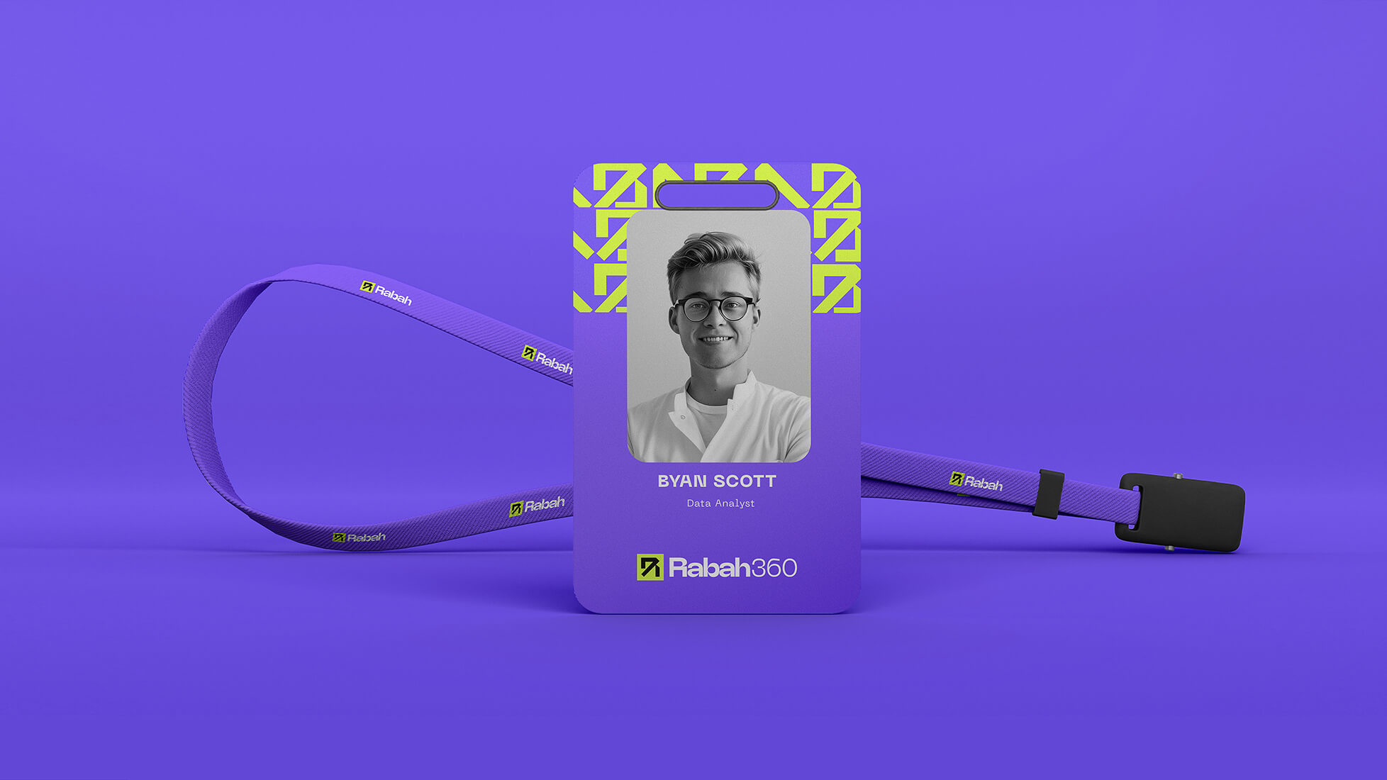
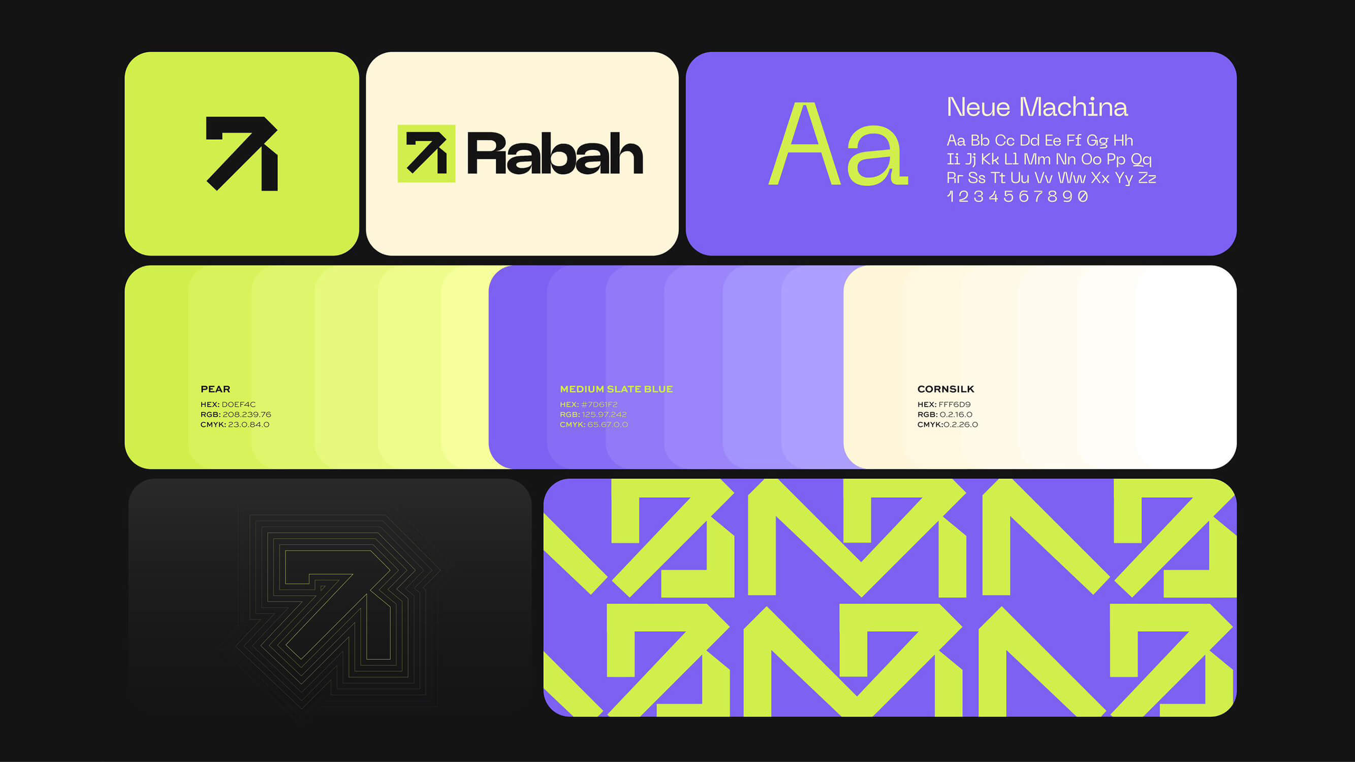
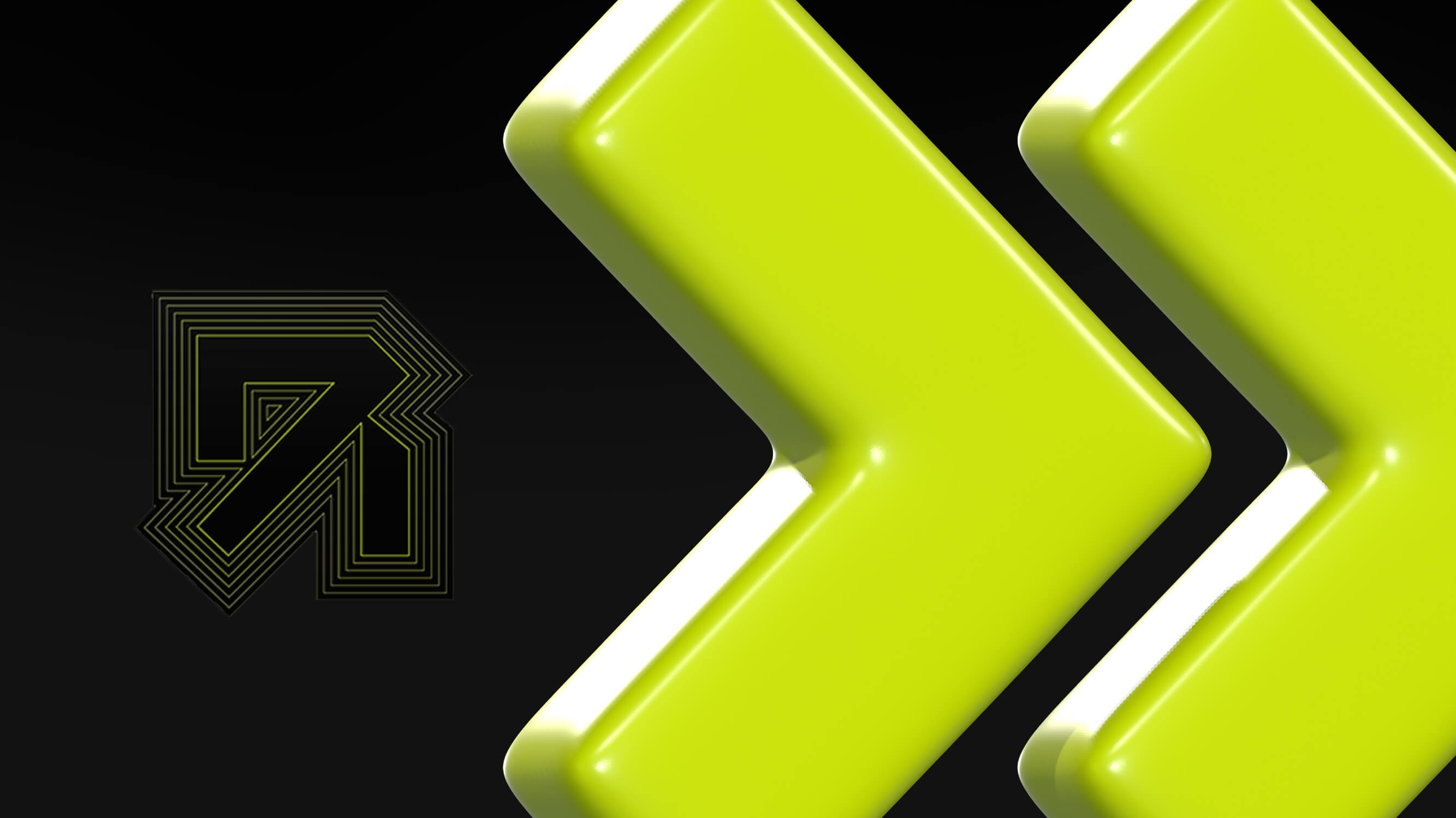
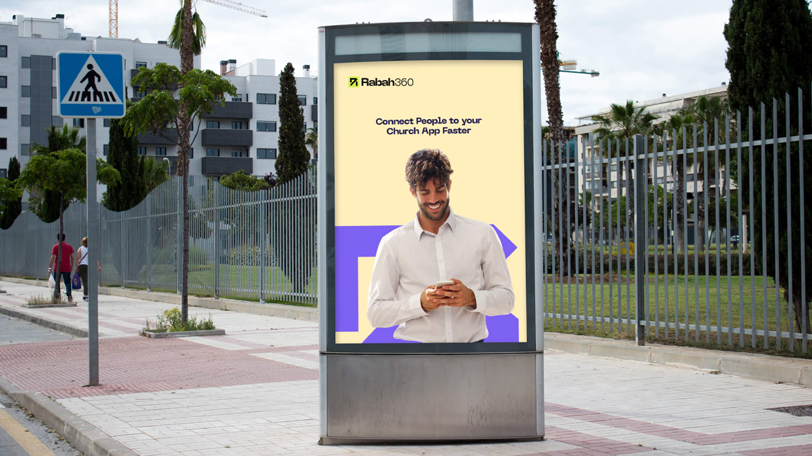
The brand identity is designed to reflect its core mission of helping churches gain and progress through efficient management. The initial "R" combined with an arrow symbolizes both the name Rabah and the forward movement and growth it facilitates. The brand identity features calming and trustworthy colors like blue and green. Blue represents trust, dependability, and tranquility, while green symbolizes growth, renewal, and harmony.
Are You Ready to kickstart your project?
Reach out and let's make it happen ✨. I'm also available for full-time or Part-time opportunities to push the boundaries of design and deliver exceptional work.
